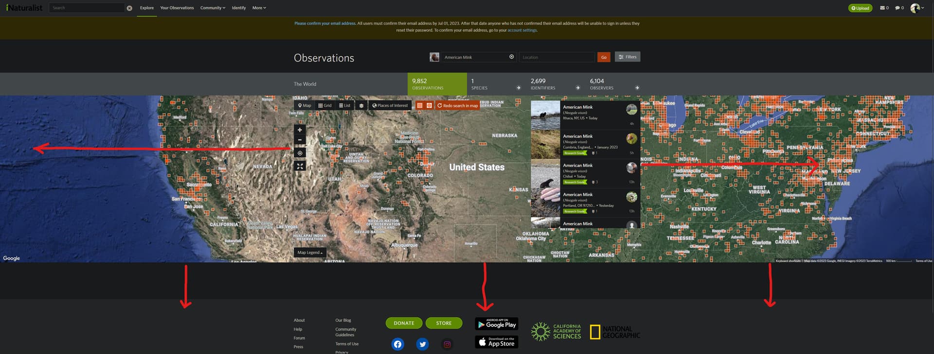
I believe this only applies to a small group of people but I would like to put it out there. When viewing observations in iNaturalist with the map, features on the map do not properly scale when using an ultra-wide monitor (This may also affect widescreens but I am not sure), causing them to hover in the center of the screen. It makes the map a bit awkward to use with features at the center blocking users from having a clear view of the map.
If possible, having the screen properly scale with resolution, including widescreen and ultra-wide, would be appreciated. Bringing the info boxes to the periphery of the screen so that people’s view of the map remains unobstructed and easier to get a full image of the area you are looking at. Also scaling of the map itself vertically as with widescreens the map appears as a strip instead of filling out the screen.
If this belongs in a different topic or doesn’t apply here I apologize.
are you talking only about changes in the map view? if so, i think there have been a lot of suggestions for Explore page updates, including more dynamic scaling (i would assume mostly for mobile, but which could apply to large or wide monitors, too). see: https://forum.inaturalist.org/t/ideas-for-a-revamped-explore-observations-search-page/8439. this kind of limited request might go best within that larger thread.
(it may be worth noting that below the buttons to zoom in/out and to find your current location, there’s a button to view the map in full screen, which might be the actual best solution to view the map on a large or wide screen.)
if you’re talking about making the whole website more dynamic for large or wide monitors, then you probably should make a case for such changes on other pages. small screens are less niche than large / wide screens, and past requests for small-screen-friendly designs haven’t gone very far: https://forum.inaturalist.org/t/mobile-friendly-website-responsive/1224.
For what it’s worth, I think it’s the horizontal resolution of the screen that’s the issue, not the aspect ratio of your screen—meaning, a square screen with the same horizontal resolution in pixels would have just as much dead space at right and left, along with of course a lot more space above and below the map, while the map interface would look just fine on an ultra-wide monitor with low resolution.
You can address this to some extent by zooming in with a browser, although of course that makes all the other UI elements bigger, too. So you don’t really get that much of an increase in usable map space, because a lot of it gets eaten up by the now-massive list of observations on the right. Basically, the UI is optimized for small, low-resolution screens. If your screen is large or high-resolution, no matter what its aspect ratio is, the UI is not going to fit well.
A similar problem with UI elements blocking the map and that huge amount of whitespace at the bottom
You’d think that the bottom of the map would be a set distance from the bottom info bar rather than being a constant height
And that the map controls and observation list would follow the edges of the screen
We discussed this and won’t be adding support for the current Explore. When the Explore page is rewritten, we’ll take a look at various screen resolution and see what we can support.