Platform(s), such as mobile, website, API, other:
Description of need:
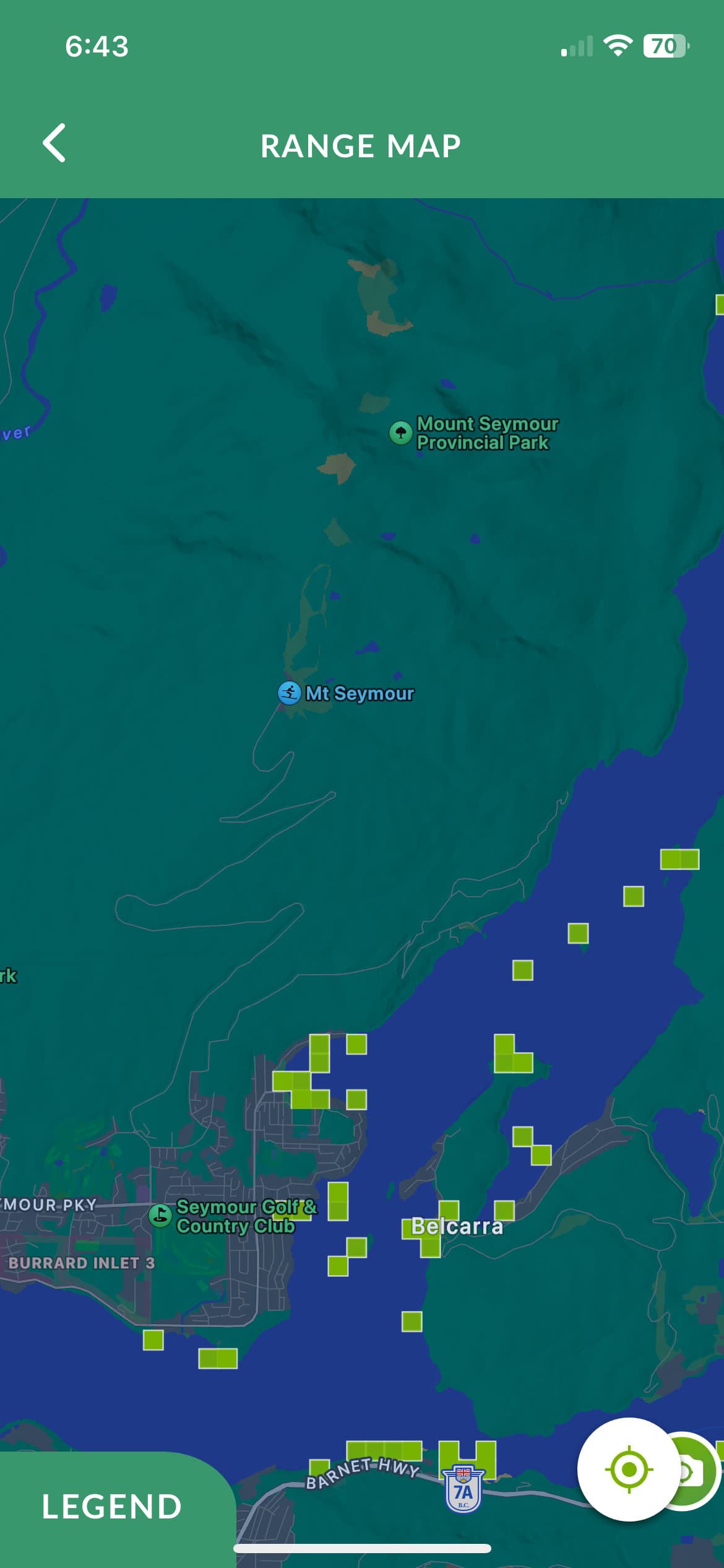
iNaturalist can be used as a good tool to identify where specific animals or species may be found in a larger ecosystem, for example, jellyfish population in an inlet, or for tracking movement of a jellyfish bloom. However, just because there is a large number of observations of a specific species doesn’t necessarily mean they are more common there than in another location, it just could be that more people frequent that area, ergo, there are more observations.
Feature request details:
Similar to the Seek range map, have a heatmap that displays what percent of observations in a given area belong to that species. You can even assign a “common-ness” score, if you don’t want to deal with tiny fractions of percentages. I’d reckon it could look like the Seek range map- as you need to divide the area into small squares in order to count observations within anyways. (Note that the Seek heatmap also simply displays the total number of observations, not percentages- I’m just using it to show the format of what a map might look like)