all it really does is put a score to what is probably already obvious – whether or not there’s a lot going on within any given webpage. it also tries to tie this score to environmental impact, but i think that tie is tenuous at best.
…
just for example, here’s the ArcGIS mapping page (it’s a whole GIS application in a webpage. so there’s a lot going on within that page.):
https://www.arcgis.com/apps/mapviewer/index.html.
compare that to my iNat identifier stats default page (it’s just a bit of text and an input box. so there’s not a lot going on in the page.): https://jumear.github.io/stirfry/iNat_identifier_stats
you can compare their EcoIndex scores without the browser plugins by going here: https://www.ecoindex.fr/en/, and you read a plain language description of what the tool is trying to do: https://www.ecoindex.fr/en/how-it-works/.
the tool gives my page an A rating, with a score of 98/100, which it says is equivalent to roughly 1 gram of CO2 equivalent carbon impact per view.
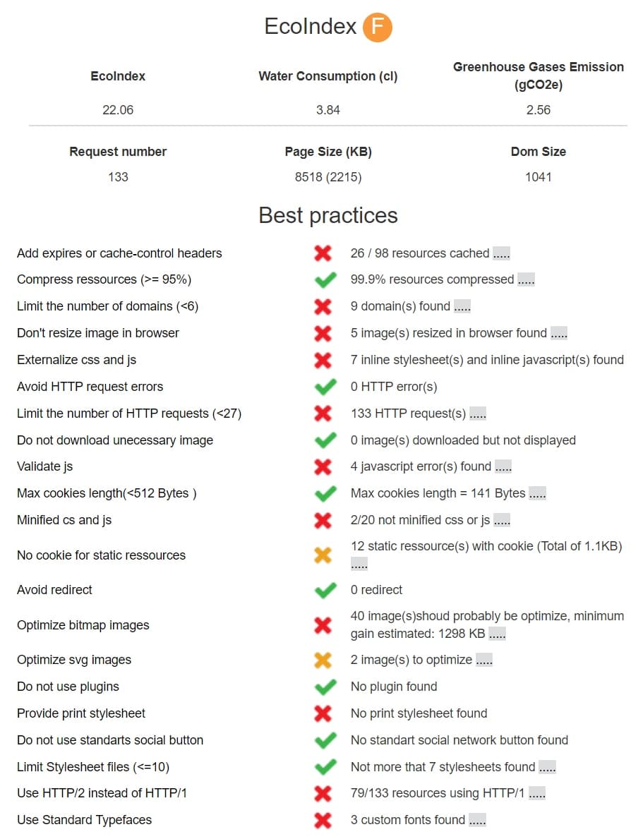
on the other hand, it gives the ArcGIS mapping page an F rating and a score of 15/100, which it says is equivalent to roughly 2.7 grams of CO2 equivalent carbon impact per view. (this is more or less the same as the iNat Explore page, which also has a mapping interface.)
…
the 0 to 100 score for telling you whether a page has a lot going on is fine, i think, but i think you have to take the letter rating and carbon impact ratings with many grains of salt.
first of all, you can sort or see based on my 2 examples above that the tool will always say your carbon impact is somewhere between 1g and 3g of CO2 equivalent per view. this is of course an arbitrary and unrealistic range because i can make a page that literally has nothing in it, and the tool will say it has 1g of impact, and i can make a page that churns your CPU and downloads terabytes of files, and the tool will say that its impact tops out at 3g.
beyond that, carbon impact has so much more to do with what kind of device you’re using, what kind of connection you’re using, and even what kind of environment you’re in while viewing the page. it has more to do with some of the infrastructure choices that the serving company / organization has made, how its employees commute to work, etc. sure, how “heavy” a page is can have an impact on the environment, but it’s only a tiny part of the overall impact.
then the letter rating implicitly makes a value rating about the page, implicitly with respect to its environmental impact. this seems misleading to me. the ArcGIS page has so much more functionality than my iNat stats page, but it gets an F grade. that score makes it seem like the page is coded in an inherently inefficient way, when really, that may just be what’s necessary to get that level of functionality into a webpage.
…
earlier, i said that the tool would be fine for starting a conversation, but let me add a caveat that a conversation doesn’t happen merely by dropping something at someone’s doorstep and saying do something with it.
imagine you’re kueda, and someone tells you that some random tool tells you that your website scores Fs all around for environmental impact, with no other context. how are you going to receive that information? how are you going to feel about someone who is essentially bringing you a problem that is poorly defined? is this a good way to start a conversation?
if you want to start a conversation, it’s much better to bring more to the conversation… examples:
- this is how similar sites scored
- here’s how other scoring tools score this site, and this is how their approaches differ
- isn’t it interesting what this other site that scored well is doing? could this be applied to this site, too?
- this is why the score is important in the context of the mission
- this is how other organizations have used the score to improve their sites, and these are the benefits and costs from their efforts