Ah, I assumed this didn’t work at all. I’m usually offline when observing.
1 Like
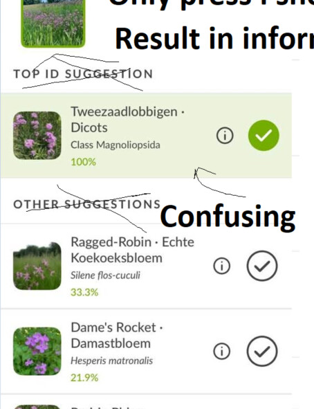
The headers are confusing as there is only one list. Just present one list and just put the best options first with % and do not use coulorus
The old apps ware good, may be the pre selections is a good idea.
It is very harrd to select. I never want information but information.
very bad and very irritant workflow
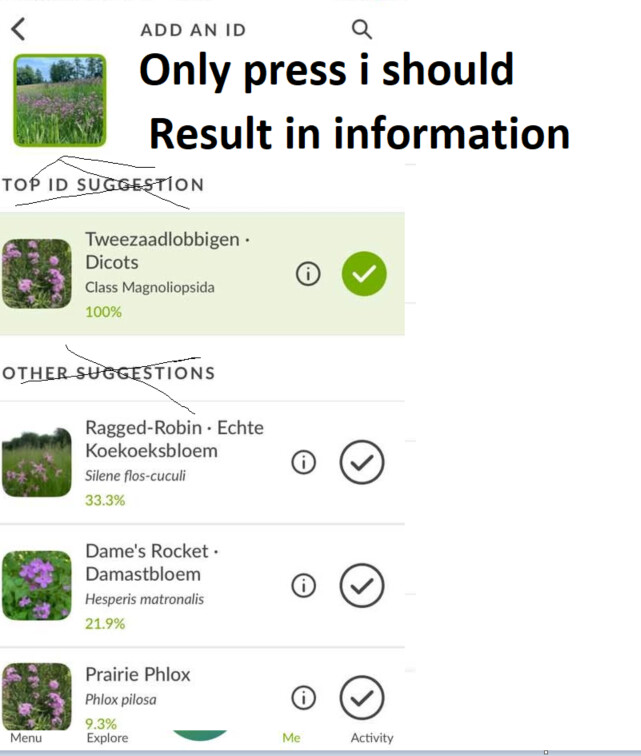
Dont put the I and select button near each other
(My wish: remove the informaton button as it costs me a lot of hours..i really hate it)
I prefer text above icons
i prefer english text above icons
Icons are never explaining.
2 Likes
I prefer (english) text above icons
english is not that hard.
I expect one list with suggestions, not two !!! in different colours
And when i want to select i always get information in stead of selection. I do not understand this workflow
I just saw the new(?) text in the inaturalist classic app but that is an ugly solution. I would say, remove all the text, that makes it much more clear
THe workflow is so confusiong that i am going back to the old app(which had changed to worse with some very remarkable changes ) or just uploadings without an ID
The old app:
Very Good menu with text and a lot of observations on one screen but the header information (account and number of observations) is rather static and i think useless on this location

I think the number of steps should be reduced with 50%. If i press YES, ACCEPT (Which isvery difficult ? it always returns with information it comes back with a menyy why not just queued or Upload ??
These steps doe not make any sense.
The focus is shifting from left to right to bottom to top. And in different colours and formats ? W
Why not just press everytime in the same part of the screen near the photos ?
It is way to diffuclt with irrelevant text.
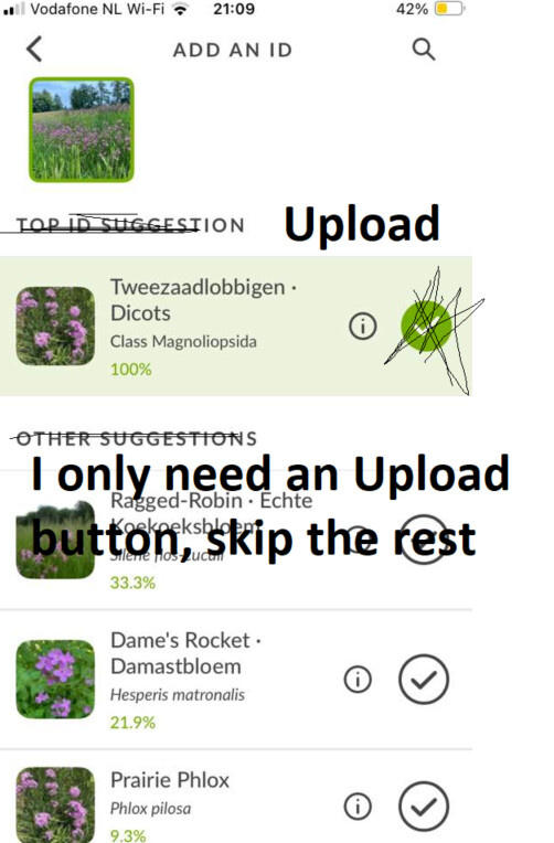
I only need an “Upload button” but that button is missing
1 Like
Definitely sticking with the old app for the time being but I feel like both aren’t as good as the android version.
2 Likes
Tap on the large checkmark button on the right-hand side to select it as an ID. Tap on the i to get information about the taxon.
FWIW, this is how Android has worked for a long time. As an iOS user it took me a little while to get used to it but it comes naturally to me now.
Hardly anything has changed in iNaturalist Classic in a long time, I’m not sure what you’re referring to.
Are you able to provide specific feedback?
1 Like
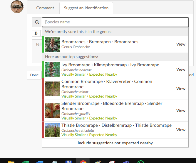
The CV has always distinguished between top suggestion – which is supposed to be a more general suggestion, by design – and the other suggestions, which are more specific. This is not a change made in the new app.
Lumping them together would be confusing, because it would mean that the list would include both parent (first suggestion) and child taxa (one or more of the subsequent suggestions; in your example, dicots is an ancestor of both Silene and Hesperis).
1 Like
You do not use bottom suggestion, not middle suggestion so why should you use a top suggestion ? And to be honest, it is not even a top suggestion at all
But this is perfect, i would appreciate a %percentage and the text is GREY. Very very good because the focus is where it should be.
Another more than excellent thing that selecting the Brandgans
This and has been voor five years more than perfect.
Why should you change this again ? I am often wondering why things have changed the last 5 years which had been more than perfect in the ten years before.
This was so good. Actually it is just for 6 years excellent. It works 2x 3x faster than the current solution. I checked a few “Top ID Suggestionds” but i am wondering if bottom suggestions are not better, they are not that top, more average.
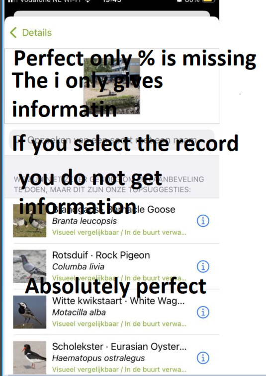
I do not see any top suggestions
The CV has always distinguished between top suggestion – which is supposed to be a more general suggestion, by design – and the other suggestions, which are more specific. This is not a change made in the new app.
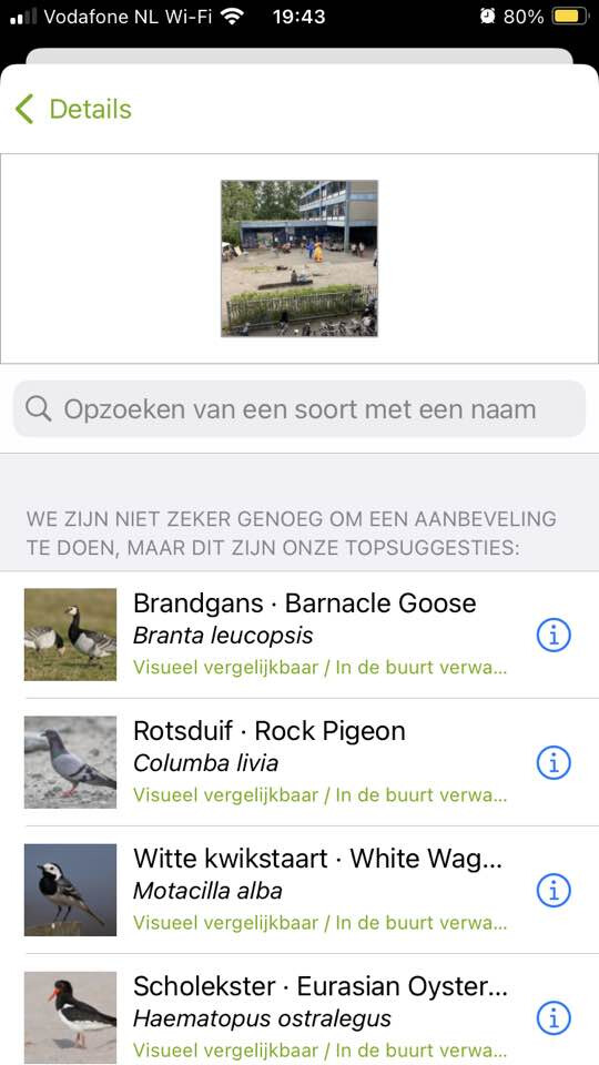
Note the message at the top above the suggestions in this case – it does not have any good suggestions. When this is the case, it does not include a first, broader suggestion, because the first suggestion is meant to be high-confidence (I don’t know why the text has been translated “topsuggesties” here – it says something like “best guess”).
Again, this is not unique to the new app and it is not a change – try out the CV on the website and you will see the same thing. If the suggestions are bad, try cropping your images and see if it provides better suggestions.
The main thing that has changed with the new app is that it includes a “confidence score”, and that it will provide suggestions when offline using a more limited version of the model. The CV itself has not been substantially altered.
3 Likes
3 posts were split to a new topic: Speed of IDs and Annotations
This is not true
First they are not Top Suggestions, Actually they are very bad.
Second ..the way it is presented on the website is much better than in the new Next App, as it is represented as just another option instead of a "Top"suggestion in a differnent lay out.
Very confusing to it takes much more time to read, under stand and often i take the wrong guess
I am totaly fine with the font, colour and layout on the website which is much better than in the new Next app. The old fashion way in the app, the website, teh iphone and android version were far better than the current one in the new app pointing to the worst ID. I would love it if it woud disappear totally as the drawbacks are much bigger than the benefits
Whether the suggestions are good or not has nothing to do with the app. If you are using the app while online, it should be using exactly the same model as the website.
I don’t understand why you are quoting me here. The visual presentation of suggestions (font, size, text and background color) also has nothing to do with what the algorithm is suggesting, which is what you complained about in your previous post and what I was responding to.
In the old app it is reverse, it is complet the opposite as it was while you are telling it is te same. What used to be the top suggestions are now a very confusing “Other” much better would be to remove the text.
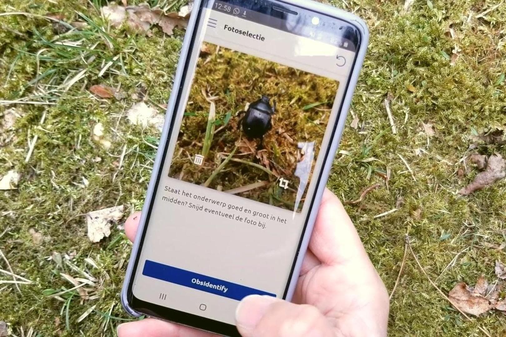
There are many things i do not like. Is there a guide why things are as they are ? There is "Evidence"but if you remove this confusing word you could make the photo twice as big. If you take another app like Identify the photo is six times bigger than in the iNat app, which make a lot of sense.
I am surprised the add button is non the left side, i would expect it on the right
And the the button for skipping the location ( “Ignore location”) is extremely big..so i used it while i did not want to..loosing the coordinates i needed. One should expect a Upload button on that location.
Other apps show the photos much bigger like ObIdentify, where the photo is 50% of the screen. I would remove all headers and make the photo at least 200% bigger. ObsIdenty h has a more than excelent, faboulous cropping tool!!!
In the iNat app the photos are small while the screen is empty.
The app says i am offline while i am not (i have 4G of 5G). Why is this ? This is no problem at all as the app is working fine, only a bit slow.
A problem in Montengro was that scrolling was not possible. It was refreshing and old data was gone which was causing a lot of refreshing. To be honest this improved when i changed from wifi to LTE (mobile data).
I used the old app (iNat classic) for checking my observations ( “ik”) and my “Activiteit” as the old heb was 10 times faster than de new iNat ap. The difference was asonishing.
I dont know why they in the new website removed the necasrry text which made the total website complete useless but in a third version the put the text on the photo itself so you have a big photo and still have the text, fields, photo information. Still no time stamp…
1 Like
The new version (1.05) that launched recently has made the app borderline unusable on my iPhone 15 Pro Max. Painful lag on any interaction; trying to click anything takes 2-3 seconds just to switch between Explore / Me / Activity.
2 Likes
Hmm. A few questions:
- Do you have any unsynced observations?
- What kind of explore filters are you using?
- Are you in standard or advanced mode?
- What happens if you log out? Is the app faster when you log back in?
I haven’t come across slowness like this on my iPhone 15 Pro, but I’m also deleting the app a lot as I’m testing various betas all the time.
1 Like
- No unsynced observations
- Default explore filters (All organisms, Nearby)
- Advanced Mode
- I am using the List View in the Me tab instead of the Thumbnail view, in case that’s helpful.
When logging out I got this error:
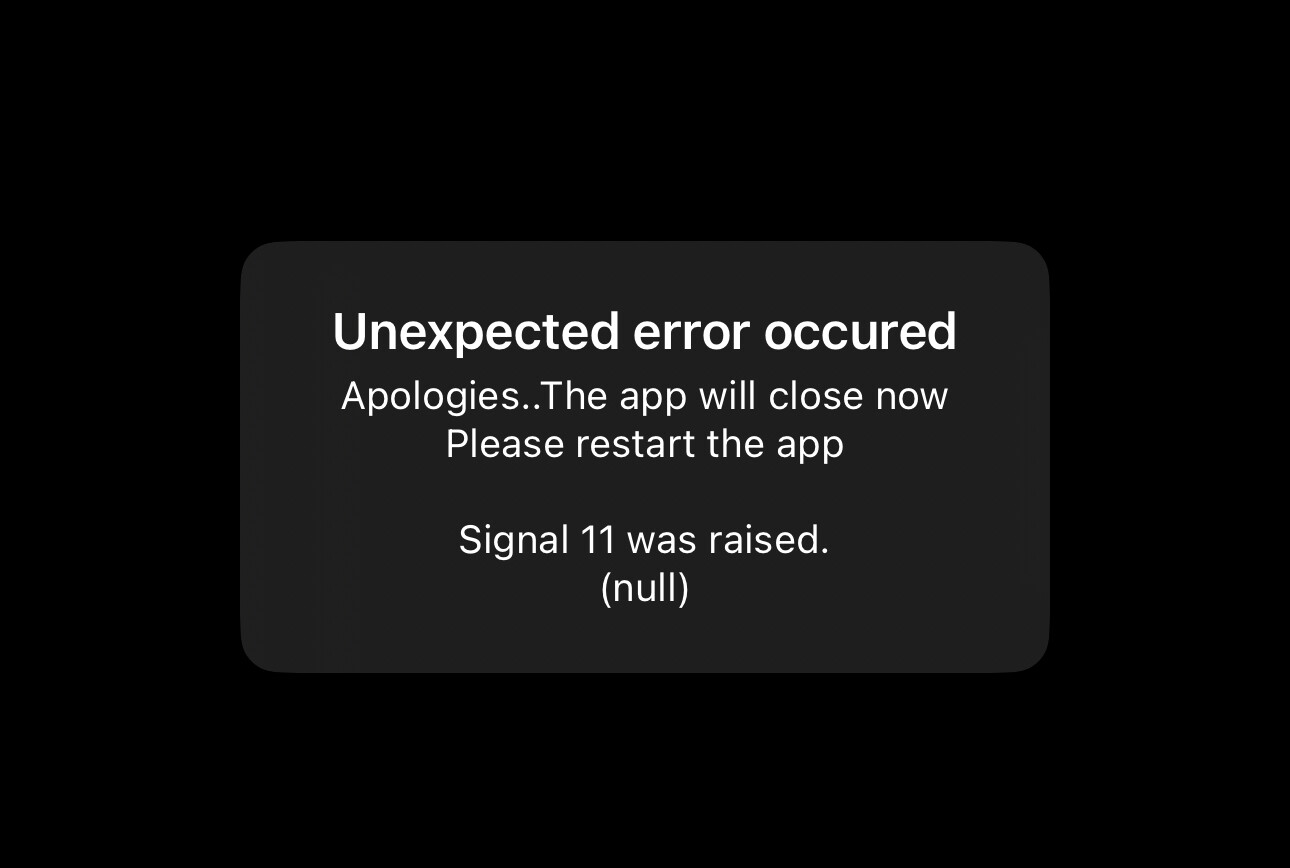
Upon logging back in, so far things are snappier and responding more quickly, even after turning Advanced Mode back on.
Thank you!
1 Like
On the iphone classic app 80% of the button event was reserved for selecting the species and only 10% for information. Why has this excellent situation changed ?
Further there is a huge button for ignoring the location casuing me to loosing the coordinates. I think the medicine is much worse than the disease in this case. Still wondering why the photo is soo small
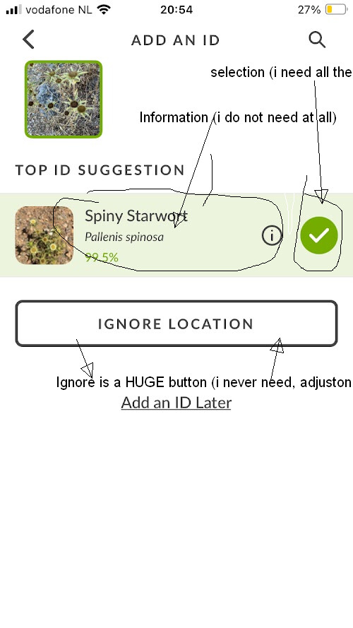
Still wondering why there is not just a SAVE (floppy disk) op upload button.
And also wondering about this strange layout. Why a green mark if you just can immediate upload the stuff ?
And if you remove “Add an ID” and “Top ID Suggestion” the photo can be twice ass big. Still wondering why not stick at the layout of the old Inat classic app.
I would expect a save, upload or send button with an “Annuleren” option if you are not satisfied with your selction and want to change something.