You have to specify if you want observations near by or global observations in the explore filter
2 Likes
As @theresephillips said, you’ll have to choose to see Observations. It’s definitely one of the biggest points of confusion, we’re working a redesign.
2 Likes
I haven’t put the time in yet it probably deserves. The very big pictures under “Me” (which I do for example to see what I have collected on the current trip and which ones have been commented on, and how recently they were taken) is a negative. I can now only see 6 recent observations at a time rather than 11 and I miss the red comment that shows someone has added info.
2 Likes
You can switch between grid view and list view here:

And if you’re using Advanced Mode, you’ll see a lot of info in list view (which I like).
2 Likes
Or maybe just have it automatically use the one with the best accuracy?
1 Like
I do like the list view more, so appreciate the pointer. It does still only give me 6 observations viewable at a time on my iPhone screen compared to 11 in Classic. I assume this is because it is providing 4 lines of information as opposed to 2 and the pictures are still quite a bit larger than in classic. But I’m looking at a list of pictures I took (and remember), so I don’t usually have to look back at the picture in detail. A very typical use case for me is to see how many of the observations I made have pulled in confirms/comments–particularly when it shows red to show I haven’t reviewed it yet.
1 Like
I found a new use for New iNaturalist. It works pretty well just pointing my iPhone at my computer screen (and selectying Use iNaturalist’s AI Camera) when I am trying to get a second opinion when doing identifications.. In the past I was making screen prints of the section of interest and uploading to a separate instance of iNaturalist in my web browser–tedious. The “suggested” tab in the web version has never worked well for me.I’m still mostly using Classic in the field.
The CV suggestions/AI has become absolute hot garbage, so much worse than before, AND the feature where you can hold down on a taxon name on the info page to copy it is worse than before, because I don’t want to copy the words “Genus Gaesischia”, I want to copy “Gaesischia” and slap it into the search bar, AND I don’t get notifications for my own content anymore, AND the new grid format for the “Explore” page is horrendous, and didn’t need a single change from the old one. That’s all. There are good things, and those are nice, but the bad very much outweighs the good here.
1 Like
I also see the only 3 observations at one time vissible while in the old app this was much more ..8. The footer in the “me” tab is large and the Header is taking 40% of my screen full time without providing any use full information. I never want to know how much observations i have and how many species and also do not want to know whicu user is logged in so that would free up 30% of my screen.Actually this “me” tab is the only tab i really will use.
I like the new 20photo batch upload and the date+time visible.
1 Like
The notification does not contain usefule information as old and new name/Id , country(code), provence(code), date+time. The old app was much better, at least it contained the new ID.
2 Likes
I use the ME tab very often (20.00 times ??) so would like too say as much observations as was in the old apps. The accountname and observatons are rather static information and would fit well on other pages

Old Iphone and Android layout was self explaining. This layhout is confusing

1 Like
I can’t even figure out how to put in more than one photo into an observatoin with it
Add photos from your album. Select all of the photos you want to group together, then click the button circled in this screenshot, and it will merge them all into a single observation.

For existing observations, click the edit button (pencil icon at top right) then there will be a + button to add more photos
3 Likes
I am primarily a birder, shooting photos with a camera, and I post my photos on both iNaturalist and eBird. Most of my photos are put into iNaturalist using a laptop. I use the iNaturalist app primarily for the following purposes:
- Uploading photos I’ve taken with my phone - usually plants, insects or fungi. This is often in real-time, but if I’m somewhere with a lot to observe I might be uploading them after I’ve left the area.
- Uploading photos I’ve taken with my camera and moved to my phone because I can’t get to my laptop. I edit the photos with another app before uploading to iNaturalist.
- Checking to see if others have confirmed my id’s for anything I’m not sure about, partly to see if I need to withdraw an incorrect id.
- Sharing recent sightings with friends, usually by text (i.e., “Hey, I just learned there’s such a thing as a Spider Ant!”). I would also use it to share older sightings if there was a way to search and filter my observations on the app.
- Occasionally to see what other people are seeing in the area.
I’m using an iPhone 13 mini, running iOs 18.4.1. and new app version 1.0.3.
Here are my thoughts on the new app, mostly negative, I’m afraid.
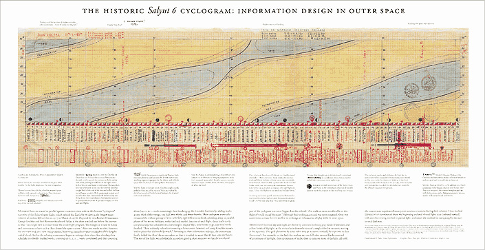
- The activity screen conveys much less information. Density is everything. (Obligatory reference to Tufte, https://www.edwardtufte.com/wp-content/uploads/2023/10/grechko-historic-visual-diary-of-spaceflight-cyclogram.jpg.) Specifically, on my screen, the new app shows activity for only the seven most recent observations while the old one shows nine, but, more importantly, the old one shows whether the identifiers agreed with my id or not. That helps me prioritize what to look at. Seeing the words “… added an identification to an observation by you.” repeated seven times on a screen isn’t helpful.
- The icons are not intuitive and don’t include any helpful text. Examples below. Make the icons smaller and add words.
compared to this:


Same for the icons below. Please add words.

- Combining some of the issues described above, the new “Me” screen both has non-intuitive icons and fewer observations per screen. The majority of of my observations have two identifications on them: me saying it’s a Northern Cardinal and someone else agreeing. Seeing that column of many twos next to the non-intuitive icon (Is it supposed to be a field guide?) and all the speech bubbles with zeros isn’t giving me much info. I’d rather have the space back to see more observations per screen. If those numbers fits other people’s use case, then have two views: compact and expanded. Also, I’ve figured out that the concave pentagon with two people in it means Research Grade, but “RG” would have worked.
- It’s nice to be able to upload multiple photos of different organisms at once, but the advantage is mostly lost because you can’t specify one location for everything you’ve uploaded. I don’t geotag my phone photos. If I’m using my phone to upload camera photos, they’re also not geotagged. If that puts me in a small minority of users, then I guess I’m SOL. But it’d be really nice if you could specify one location for a whole bunch of photos of different organisms at once in the app.
- Along those lines, since our accounts have the pinned locations that are so nice to use on the desktop, can those be made available in the app? Even better if we could add new locations using the app. Selecting the same location over and over again for a series of observations in the app is unbelievably tedious (either the new or old version, but it seems slightly worse in the new one - let me know if you want details and I’ll run a test).
- Some of these shortcomings would be less important if the website had a mobile friendly version. Has that been contemplated?
- Speed. I can’t say for sure that the new app is always slower, but I swear under my breath every time I hit this button,
and see this animated cascade of icons,
.
The animation is cute, but it shouldn’t appear repeatedly in the middle of our workflow. Maybe it’s not actually slowing down the app, but it certainly can’t be speeding it up.


To summarize, anything you can do to strip out nonintuitive icons, increase information density, and increase speed would be great.
I love iNaturalist. Thanks for all the work!
9 Likes
Forgot to mention: to share an observation, I now need to hit “Details” (a non-intuitive place for the command), and scroll down to the bottom of the page to find the word “Share.” The old app has the universally used “share” icon right at the top of every observation. Granted, in the old app it overlays the photo and isn’t always visible, but it was usually nice and prominent. (And regarding app speed, just hitting the “Details” button causes a beat or two of delay - you can tell the app is thinking. The old app feels snappier.) Thanks again.
2 Likes
I completely agree with your points about cutting down on unlabelled buttons and animations. I’ve posted previously about how slow the new app gets, especially when a lot of observation drafts are saved. If any change at all can speed it up, it’s necessary; I’ve resorted to using the old app again.
The lack of labelling the icons caused me to select the wrong option on several menus several times as I got used to the new app. I’m not sure how intuitive an icon like “camera with sparkles” is to the general public; I don’t think “AI Camera” is a concept in wider use, either, though I could be wrong. I’m especially not fond of the photo folder upload screen’s options, where the dark grey combine/split options are not any sort of universal symbol that I’d encountered before. I could not figure it out the first time, when I needed to combine additional photos quickly, and just went to start an observation draft with the “no media” option and then add photos through the “edit observation” screen instead, just because that was at least intuitive if familiar with the old app.
2 Likes
Can you please provide some examples? In general I find it working quite well, but specific examples would be helpful in investigating issues.
Again, specific examples would be helpful. Sounds like a bug, since the app should be showing you activity on your own observations.
You’ve provided a lot of feedback, but no screenshots, which makes it hard to follow and know exactly what you’re referring to. Please include screenshots if you’re going to be providing feedback about design.
First, thanks for the detailed feedback.
I recommend turning off notifications for confirming IDs. Then the only notifications you’ll see are ones where someone refined or disgreed with your ID. See more [on this help page](https://help.inaturalist.org/en/support/solutions/articles/151000198927\).
However, I agree that including the name of the taxon, like in iNat Classic (below), would be an improvement.

IMO “intuitive” is not particularly useful because it’s so subjective. What’s intuitive to one person may not be to another and vice versa.
Regarding the icons and lack of labels on icons, the thoughts behind it were:
- it reduces the need for translation and the formatting issues it causes. What may fit well in English may not in German or French or Russian, and that’s not even considering support for large font sizes. Similarly, “RG” might work for English, but abbreviations may not work so well for other languages and create more of a translation workload for volunteer translators.
- There are a lot of languages to which iNat has not been translated, or maybe don’t have a written language. So, we tried to make the icons stand on their own, which is not easy.
- A significant number of people are colorblind, so we didn’t want to rely on colors only to convey information.
I think the icons can be improved and I personally would like to see labels for them as well, maybe that will happen. Maybe we made the wrong choices (and we’ll try to improve them), but I just wanted to give some insight into the many considerations that go into these choices.
They’re available in Android, so I think they’ll eventually be available in this app. However, the mobile app is designed for use with photos that have location data in them. The website can be used for photos without location data. A mobile friendly version of the site is probably a ways off, it’s a big job.
As for app speed, we’re definitely looking to improving it.
4 Likes
Thanks for setting up this thread and for the replies.
2 Likes
Besides adding the taxon ID that gets suggested, I think a huge improvement would be to state in the text (and color code it) whether this new ID supports or disagrees with your ID or the currently leading one.
This way it’s easily distinguishable to which you’ll have to pay more attention to.
4 Likes
Sounds like they’re moving away from color-coding, to make the app useable by the color blind. But ![]() and
and ![]() icons would work.
icons would work.
2 Likes