A good way to prevent colour (love the ‘u’, are you Canadian too?) is to edit in LAB mode’s ‘L’ (Luminance) channel for detail with the preview on for all channels. Works well for sharpening, tonal adjustments. But sometimes, the colour truly IS washed out by a poor guess somewhere along the line (silicon or biological software), and you need to step in.
But how much do you step in is always the big question. Colour is exceptionally subjective (not just the spelling) because it is so processed by the human observer. We tend to ignore colour light castings/reflections and replace them with what the optical system ‘thinks’ should be the right match. And we haven’t even touched on the technical rabbit holes of colour calibration between systems and in particular digital screens.
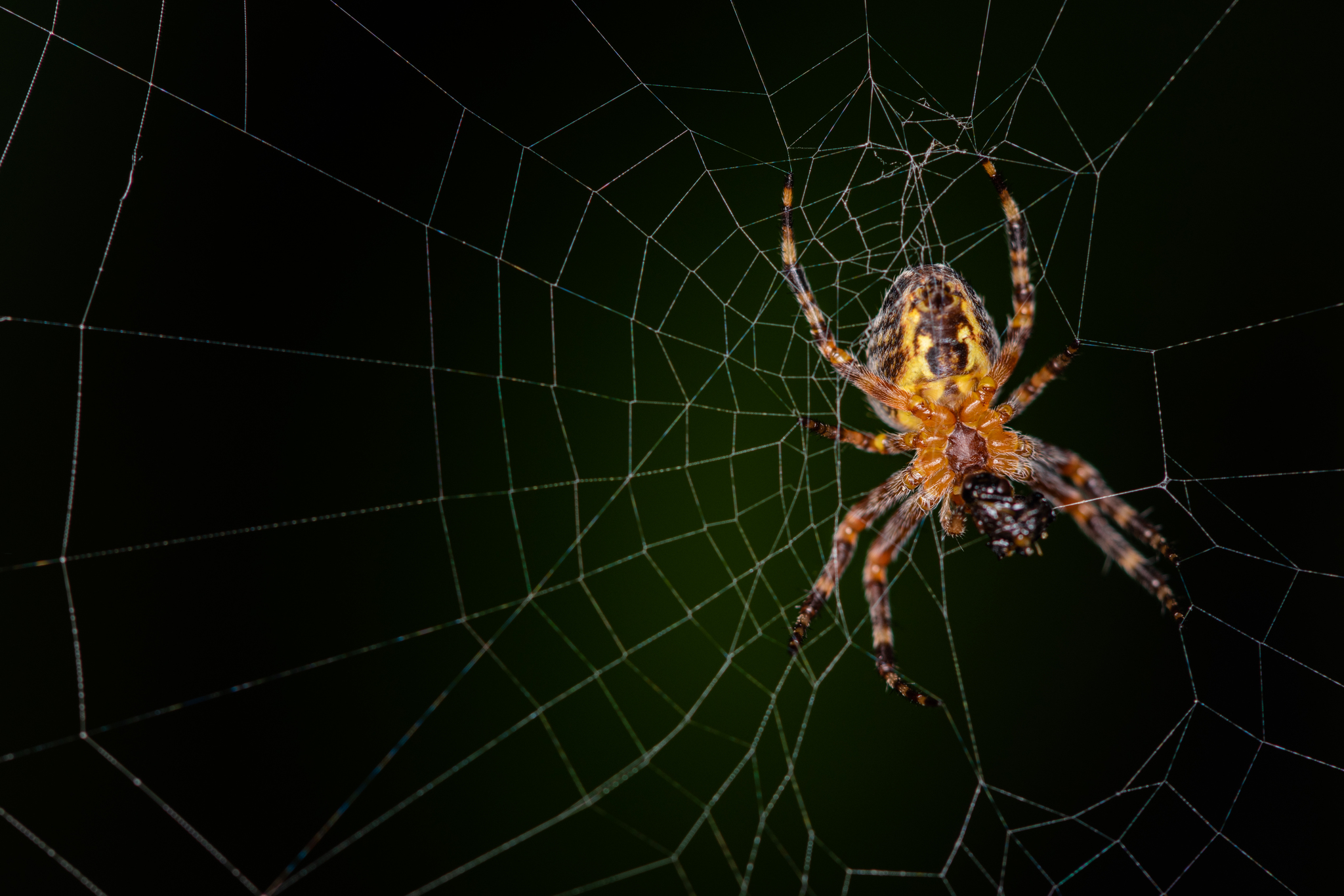
Of course the other danger is that if we become too dependent on digital correction we risk shifting ‘normal’ itself. And in some ways, this is more of a risk with wildlife because everyone really wants the most brilliant, vivid, ‘natural’ look in their shots. But as we all know, natural – and in particular biological – surfaces can vary tremendously dependent on natural lighting conditions, surface optics (iridescence of butterfly wings, bird feathers, for example) and even cognitive viewing biases (colour contrast, as an example).
So if we start to push colours into what we would ‘like to think is more believable’ range we risk encouraging more data distortion. I’m think of all the impossibly vivid shots of flowers and birds I’ve already come across.
Plus, it effects identification and identification skill-building. A lot of organisms utiilzie drab colours very effectively for survivability. Does that mean that we should digitally remove that drabness?
This discussion reminds me so much of much of my career work as a corporate designer and all the times we were provided with very poor, unflattering photos to work with, or when a client (or manager!) would ask us to subtly improve VIP shots. I called it ‘Virtual Realtor’ editing—so named because of the phenomenon that realtors never seem to age at all in their published images over time. But it’s true with almost all public people imaging these days. (With an accompanying negative effect on young women, most sadly.)
Technically, when it comes to identification photography, the professional guides seem to be a little split on their approach to realistic colour. It’s more understandable with illustrated or painted works, for sure. (And yet, ironically, a good painting or illustration actually looks MORE realistic than a lot of photography!)
But how many times have you found yourself thinking, ‘Gee, the specimen I saw didn’t look nearly so vibrant’?
Deep fake iNat observations? Hmm… I sense another topic brewing.

