You know that type of animated graph that you don’t know the name of? Turns out bar chart races are pretty easy to make these days!
So, (naturally), I decided to make one visualizing the cumulatively most-observed USA butterfly species on iNaturalist during 2024. And while I am bummed there doesn’t appear to be a way to embed the animated graphic into this post, here’s the link:
I reckon some of you might enjoy this as much as I did.
Behold the glorious Red Admiral building a substantial lead, only to be overtaken by the mighty Monarch!
Witness the mid-summer Swallowtail invasion!
Marvel at the rise and fall of the glamorous American Lady! (Is this not apropos?)
All this excitement and more await you at the above link!
Basically, I input into an Excel spreadsheet the cumulative number of research-grade observations for the 10 most-observed USA butterfly species from Jan 1 2024 thru Jan 15 2024, then the 10 most observed from Jan 1 2024 thru Jan 31 2024, then the 10 most observed from Jan 1 2024 thru Feb 14 2024, and so on, for the entire year. Then I plugged the data into a magical bar chart race maker, fiddled with it until (I thought) it looked really cool - and now I present it to you, for your compliments, criticisms, and general breeze-shooting.
Enjoy!
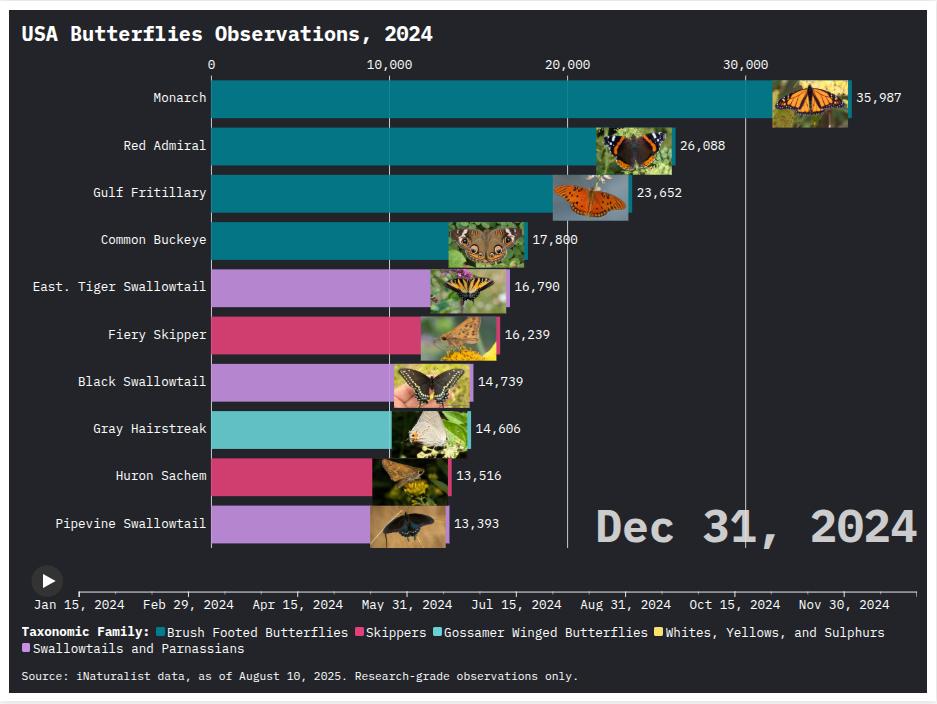
Edit/Spoiler: Here’s a visual of what you’ll see at the end of the animated graphic!
Hey now - don’t forget these are research-grade observations. One could theoretically move the needle on the identification side of things!
Confirm (correctly) the 3500+ unconfirmed Pearl Crescent observations for 2024 and they’d hit 8th place! Am I threatening you with a good time? I dunno!
When a species fell out of the top 10, I had stopped inputting the numbers, not realizing it handled that by averaging the number down on its way off the chart.
I would be really curious to see what this same race looked like if it was observations per year over the life of iNaturalist. In other words, showing abundance changes year-over-year. Would it be relatively static or show dramatic changes?
Here’s something somewhat related - Romanian iNaturalist Users: Total Cumulative vs. Yearly Active (we had a late start on iNat) https://www.youtube.com/watch?v=xfaKSPEZ1ns
That’s an interesting question! I suspect most of them would show year-over-year increases, just due to the site getting more use. But the comparative rate of increase for each species would be interesting…
I’m thinking about the same sort of thing for birds, too!
That could be because there are Monarch monitoring blitzes (both regional and international) and more active monitoring of them due to their precarious conservation status.
Of course, the very fact that they are so frequently and deliberately observed may give a false impression of their abundance.
see https://youtu.be/rwwJ4AqIe94 for 10 years through 2024, created using on an adapted version of the thing i referenced in my earlier post.
Monarch is always the most observed species among butterflies, but others change their position in the top 10 (or fall off altogether) in different years.
my 2024 results look different from your cumulative total at YE2024 for some reason. it’s similar, but you can see for example that mine includes Pearl Crescent, which yours excludes altogether. i suspect that maybe the way you’re aggregating things, you’re accumulating counts of only the species that make the top 10 in any given month, which won’t give you a true yearly total.
It’s interesting that cabbage whites didn’t crack top 10 this year, since they’re #7 overall in the US and they’re very common. I wonder if that’s tied to them being a small, unimpressive butterfly?
I see those fairly often, but I don’t have very many observations of them, for two reasons.
They’re energetic. It’s hard to get close enough for good pictures without following one a long way, probably on difficult terrain.
They’re boring-looking. They don’t catch your eye the way a swallowtail or a monarch does. In general this wouldn’t stop me from making observations, but combined with Point #1 it makes them not worth the effort most of the time.
@pisum
It looks to me like you’re pulling all verifiable observations, while I only pulled research-grade observations. There are an awful lot of unconfirmed Pearl Crescent observations!
@quyksilver & @fluffyinca
The comparative Cabbage White numbers for 2024 caught my eye, too. It is indeed sometimes difficult to get a good photo of them. Or any photo at all - I missed one this morning, haha! But that just makes the decent shots all the more satisfying; I was happy to get this photo last month! https://www.inaturalist.org/observations/298981805
They’re not as flashy, but still quite beautiful up close (I think).
When i was a kid, I remember some of my peers insisting that they were cabbage moths, not cabbage butterflies. Presumably, basic white doesn’t fit some people’s ideas of what a butterfly should look like.
ah, that makes sense. i missed that criterion. it is rather surprising that Pearl Crescent is so underverified. maybe i’ll have to do some identifying of those for IdentiFriday.