Can you change the tooltip of the buttons at the top right of the observation detail page to indicate whether the arrow is navigating to newer or older observations?
On iNat, the right pointing arrow goes to newer content, but on some sites similar buttons actually go to older content.

Gmail - left is newer, right is older

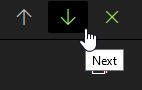
iNat observation detail - left is older, right is newer

Default Identify pagination (and arrows on pop-up modal) - left is newer, right is older
Alternatively on the observation detail page they could be up/down instead to indicate the newest observations are at the “top of the stack”.
Outlook - left/up is newer, right/down is older
I personally rarely use these buttons on iNat, but when I do, I never know which one to press to view newer or older observations.
I would vote for this if I could be bothered to janitor my old votes. So I’m left to voice my support here – these arrows confuse me constantly, even right after I had figured them out I forget again. Please indicate somehow which way they point w/o actually clicking on them.
2 Likes
I use these buttons constantly, but even after over three years of iNatting I still somehow manage to get it wrong over half the time. Definitely would support clarity.
3 Likes
I agree.
Would also be nice to be able to flip through obs by date observed rather than date added.
3 Likes
Just to note that now that votes are more plentiful, I could and did actually vote for this feature request.
That the topic gets bumped is just a side effect, honest.
1 Like
Thank you for linking it, it’s something we all should vote to!