Maybe someday I’ll spend enough time in a county to be responsible for turning it green. Major goals! I’m surprised that Luzerne’s not darker given all the time rkluzco has spent documenting the species there- I assume the Wyoming Valley’s population is just a lot to overcome.
Sullivan being dark green has to be because of Rickett’s Glen. Forest is probably because of its low pop and high coverage of public land? This is really fun to puzzle out!
Amazing!! I was ready to make a quick PA map myself, I’m so glad you did it for me. Quick note- I noticed a typo in the Lawrence county (Pennsylvania) data where it’s recorded as 18.063 instead of 18,063, so the per capita rate is 0.000 when it should be 0.214.
Credit where credit is due, looks like more than half of all Forest County observations in 2024 were made by a friend of mine, @ericschill, who logged a few thousand observations there. Most of his observations are of plants, I’m sure he’d appreciate a hand identifying some of them.
I don’t get it… Some French departments should be greener than they are on the map. For example: Lozère and Haute-Corse rank 3rd and 4th but are deep purple, whereas Alpes-de-Haute-Provence (ranked 5th) is pale green…
Mixed results for nominative determinism, it seems. The highest rate of observations in Forest County confirms our expectations, but Lehigh County appears to have le low observation rate.
I believe Forest is our only county with no traffic lights now (Sullivan has one in Dushore), so I’m glad to see it’s getting well-covered despite the small human population. It’s a shame York/Lancaster are so low… I’ve always thought there must be some really neat southern species sneaking into the state along the lower Susquehanna. But like you said, it’s so hard to find intact habitat down there.
To be clear that wasn’t directed at you, but I greatly appreciate that you’re willing to identify some of them! I have to go through and try to identify some of them myself.
@calvertm - Good catch on Lawrance County, PA - I fixed it!
@adam_kalab - Good catch on Newfoundland/Labrador - fixed! I was so distracted by figuring out the mapping workaround, I accidentally took the total number of N&L observations, instead of the 2024 number. So that lowers N&L a good bit. @dennyb & @jdjohnson
@lynnharper - Regarding change across the last five or ten years - it can be done; I’ll think it through. @scottdwright had some interesting thoughts - I think I’m going to pull the “observers per Capita” data and see what that looks like.
I think there is an obvious bias towards more populated areas with the observation map simply because the amount of iNat users is not necessarily correlated with the actual population of a place.
I’d like to see how the map would compare/change if made with iNat user data rather than census data. I think some smaller states may shine brightly even despite a much smaller iNat userbase.
The map showing Mississippi being the smallest makes sense- but only because there are just less overall users of iNat overall here than surrounding states. Though I still think regardless of the map- we will still fall behind due to the same reason.
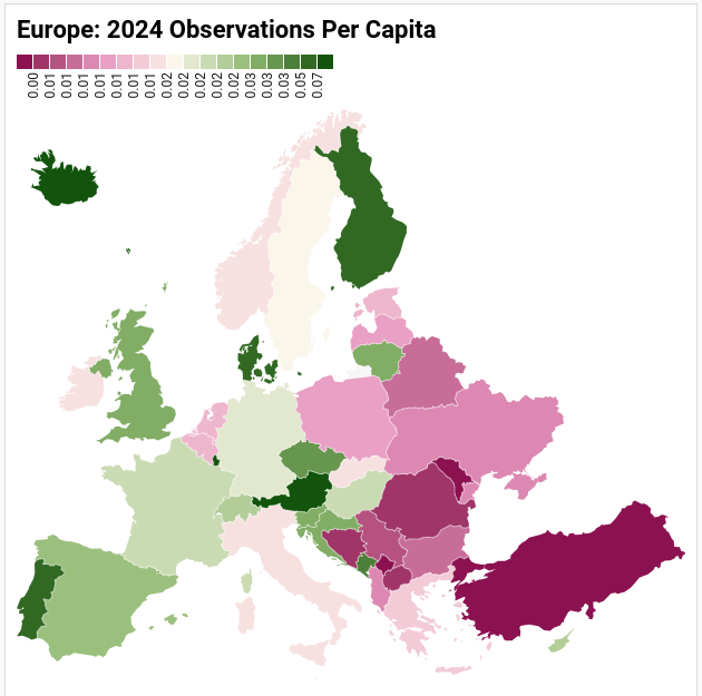
@loustineaforest - Since you didn’t have time today, I grabbed your Europe data, fixed Belgium, and generated the map! Easy to do when somebody else already did the hard work of compiling the data! (Don’t mean to step on any toes - forgive me!)
Currently Florida has 5,095,191 RG observation, more than most US states, but unfortunately it is also the 3rd most populous state with ~23,372,215 people.
California has the advantage despite the high population of being the starting location for inat.
Edit- I missread the statistics, only counting observations in 2024, disregard my prior statement
although I would like to see all time observations per capita graphed too
thought i’d do it tomorrow but it was a quick enough fix, it’s updated in the reply. I transposed one row for another in the data for the map and everything broke, thanks for pointing it out!
I do wonder how these maps would change if we went by biodiversity of the observations. When I draw a circle around Greenville, NC, it is solid with observations, and the stats show 9,598 observations by 849 observers; but only 1,899 species. The top species (Great Blue Heron) has 184 observations, and after 186 species, we are down to single-digit numbers. If i plotted these species as a line graph by number of observations, it looks to me like it would come out as an asymptote. This helps me to understand how, in such a seemingly well covered area, I keep getting regional firsts (all three Plantago aristata within my circle so happen to be my observations – all from different locations). Of course, I don’t see a way to measure how big my circle is, but it encompasses the entire Gity of Greenville as well as surrounding communities and rural areas, as well as our two largest nature parks.
A lot of observations doesn’t necessarily equate with high biodiversity or lots of intact natural habitat. A lot of the observations in Los Angeles are from city parks and urban spaces