Are we talking about this? (Cuz that’s what I’m talkin’ 'bout.)
Ohhh, I see. Yeah, I don’t have that. Makes more sense knowing we weren’t talking about the same thing!
1 Like
A classic ![]()
3 Likes
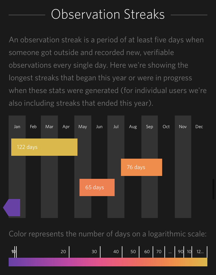
Interesting. I don’t have that on my personal summary, but maybe it’s because I didn’t have any observation streaks of at least five days? (I don’t do many observations of my own).
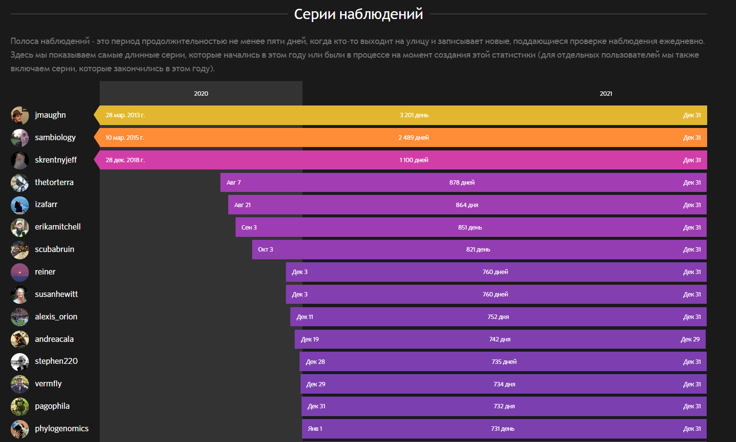
Identification streaks would be fun.
And while I’m on the subject, having some way of seeing your forum activity streaks would be fun, too.
2 Likes
Observation streaks are on personal Year in Review pages but not global or network pages in 2022.
4 Likes
It is possible that, because that is early spring in the northern hemisphere all us winter bound folk decided to get out.
2 Likes
Interesting. I kind of complained a bit over the meager 28% RG I have for this years obsrvations… but if I have a look at NaturaLista Colombia stats, that seems just about right, its also only at 30%
But looking at Ecuador and Panama I will immediately stop complaining and instead have a look how I can help out pushing those needs ID there :-)
4 Likes
Great Southern Bioblitz Oct 28-31. Was hoping to see a little sister spike to match the City Nature Challenge. If I use a bit of imagination, I can see a little third cousin spike?
2 Likes
Going to the various southern hemisphere network site stats, you can see a spike on some. Australia’s is quite large, as is Argentina’s.
2 Likes
Nice - Australia has a bigger and better spike for GSB vs CNC!
1 Like
Great to see another fantastic year! I really love the donut chart of my observations, but is there a way to make it display all of my observations (i.e. including node-level observations) instead of just leaf-level observations? It’s frustrating that the numbers don’t line up properly. E.g. here I have 10 observations of Torbia, all of which are identified to species:
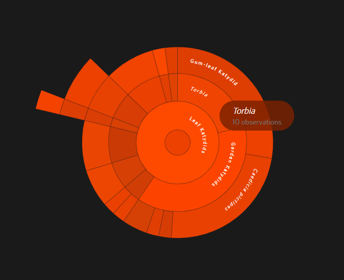
I also have 10 observations of Polichne, but 8 of those are either undescribed species or unidentifiable nymphs, so the chart says I have 10 observations but the display suggests that I only have two sightings!
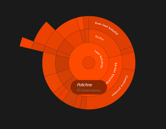
Is there a way to make it show the true number of observations?
Yeah, seems like it should work the same way it does on collection/umbrella projects. Maybe something to look into for next year. I’m pretty sure it’s always worked like this on YIR, but don’t know for sure.
I don’t see any observations at https://www.inaturalist.org/stats/2022/matthew_connors and it looks like it was last generated on August 18th? What’s the URL of the page you’re on?
1 Like
Oh yeah sorry, that’s for 2017. I am behind on uploads so I have no sightings this year :P The URL for the chart is here and the relevant sightings are here.
Could you comment on those graphs we discussed earlier?
it sounds like you’re describing the same issue described here: https://forum.inaturalist.org/t/year-in-review-sunburst-chart-does-not-incorporate-observations-of-non-leaf-taxa/26389.
1 Like
Yes that’s the same issue! I didn’t realise it had been brought up before. It’s nothing major but it is annoying. :/
Hi there,
I really like the “sun” diagram, what a great visualisation tool !
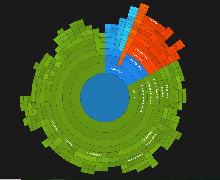
Would it be possible to apply it to a specific project or localisation ?
3 Likes
You mean this?
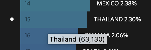
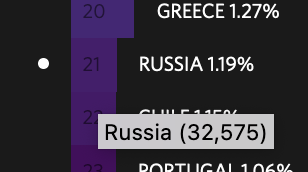
If you’re talking about % of total growth for 2022, I’m seeing 63,130 for Thailand, and 32,574 for Russia if I mouseover them.
No, those take up a decent amount of resources to generate, I believe, so they’re only on Year in Review.
if you mean filter by user + place or filter user + project, you can get the data you need from the API endpoint that provides underlying data for the “dynamic life list”. but you’d have to crunch the results a little and then use your own tool or code to visualize it as a sunburst. here’s an example where a sunburst chart is generated from the dynamic life list data: https://forum.inaturalist.org/t/better-life-list-visualization/1555/15.
if you want to filter by just place or just project, that would be a more complicated process since i’m not aware of anything single thing that provides the required data in a format that is close to what you need for such a chart. you’d have to jump through many hoops to get the necessary data.
however, at some point in the future, places should get their own version of the user dynamic life list. so presumably when that’s available, you should be able to use the same underlying data to generate a place-based sunburst chart relatively easily.