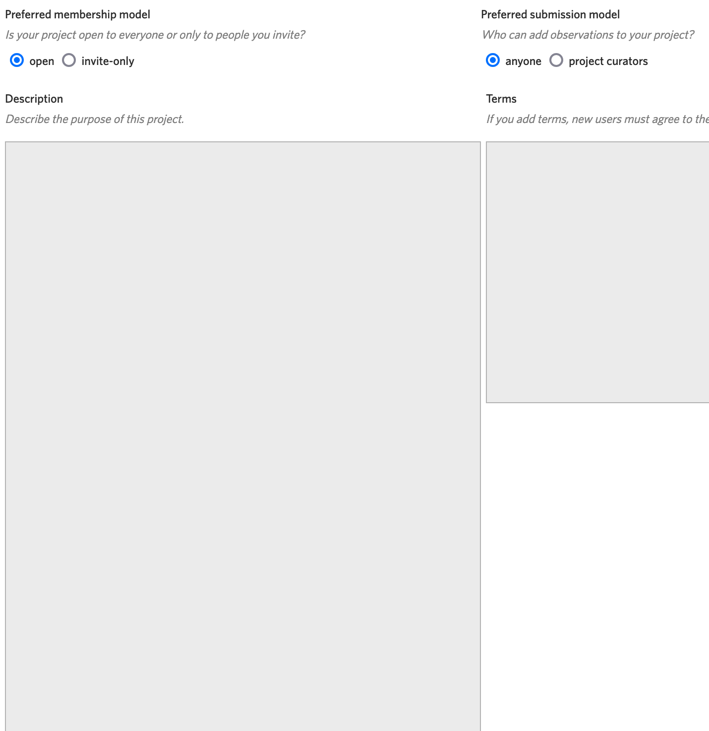
Platform Website
Browser Chrome
Screenshots of what you are seeing
Description of problem
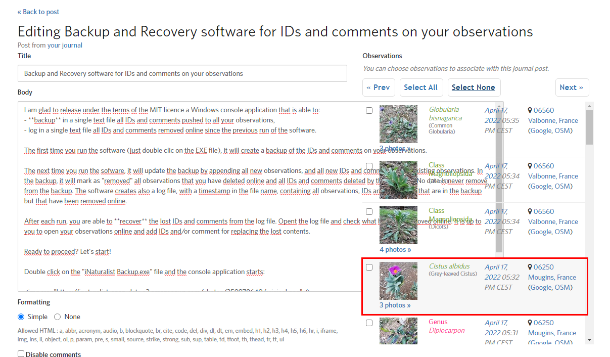
The left text panel, when enlarged, is behind the right panel, but should be in front of it.
i don’t really understand why the input boxes are resizable here. why would anyone need to resize the box beyond the original size? if there’s a bug here, to me, it would be that the boxes are resizable at all, not that the boxes overlap each other when resized. or if you really need them to be resized, allow resizing only in the vertical, not horizontal direction.
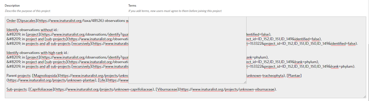
Easier to edit the content like this (provided the issue is fixed) :
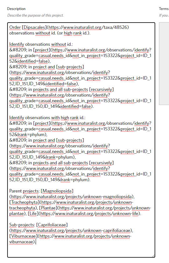
Than like this :
I do consider that this is a bug.
A control that has the focus should not be covered.
It is likely a matter of one line of code (see z-index).
it’s a little more complicated that that, but even if it were just a line or two, is it even worth the effort to make any changes to this page?
this is such a niche use case. it seems like the best solution is to edit your text in your own text editor of choice, and then copy and paste it into the project description input box. (for me, Notepad in Windows works well if you’re trying to do text editing without word wrapping.)
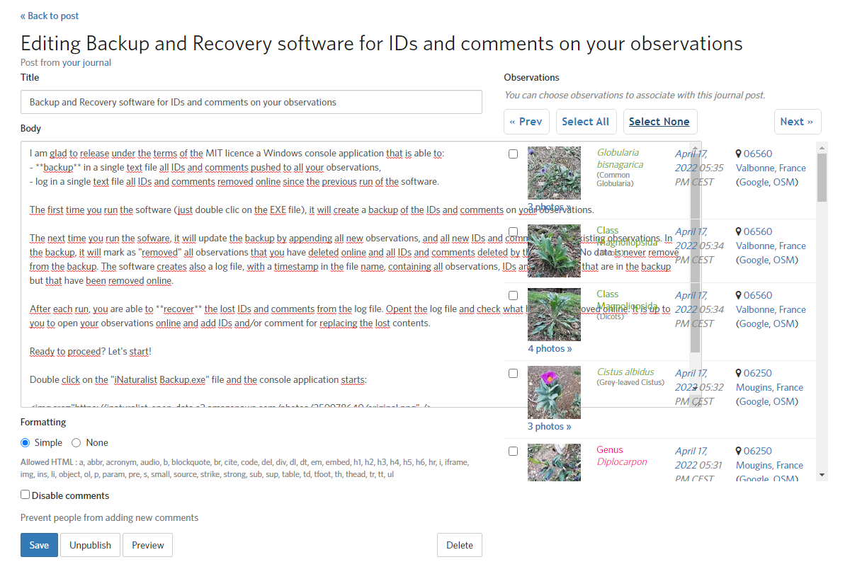
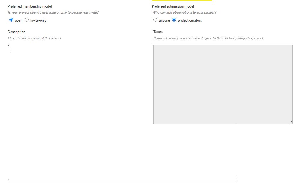
Hello! What about this (editing a journal post)?
It’s a similar bug, and worth correcting, isn’t it?
my opinion is the same as before. if there is a bug to be fixed here, it’s that these input boxes really shouldn’t be resizable, or else they should only be allowed to be resized in the vertical direction.
in the journal post case, i bet that the number of users who’ve ever tried to resize that input box are less than 1 in 10000 who have ever written a journal post. again, a very niche problem, and the problem can be worked around simply by saving the draft and reloading the page. so i don’t know why anyone would want to spend effort to try to fiddle with manipulating z-indexes based on focus.
No change to do based on focus.
Just give a constant higher z-index (say 100, hardcoded) to the control that is on the left so that it will cover what is on the right when it gets enlarged to the right.
This is not a significant effort.
And the fact that no one else reports the issue does not mean that no one else would appreciate the fix.
it’s funny… i’m not going to go through the code history, but i can imagine that they made the text input boxes resizable because someone back in the day wanted to be able to see more of what what they were editing. the developers probably thought at the time: “well, even if there are problems resizing horizontally, nobody’s going to care because being able to resize vertically is better than not being able to resize at all.”
if they now make the changes as you’re suggesting, sure, the thought process would be that you can simply shrink the leftmost input box to reveal the contents to the right. but i can see someone posting a bug report in the forum sometime in the future saying that they consider this behavior a bug: “why doesn’t the object in focus come on top? why do i have to shrink the input box to see this other stuff? i should be able to just click on this other stuff, and it should rise to the top.”
Of course not, I don’t expect the text panel (input box) to be already enlarged when the page opens, with the text panal covering (hidding) what is on the right. And sorry If I still don’t catch well the point.
I can just tell you, as an IT engineer, that if anyone in the developer team I belong to presents a screen with such a behavior, the peer review of his work would not last more than one minute.