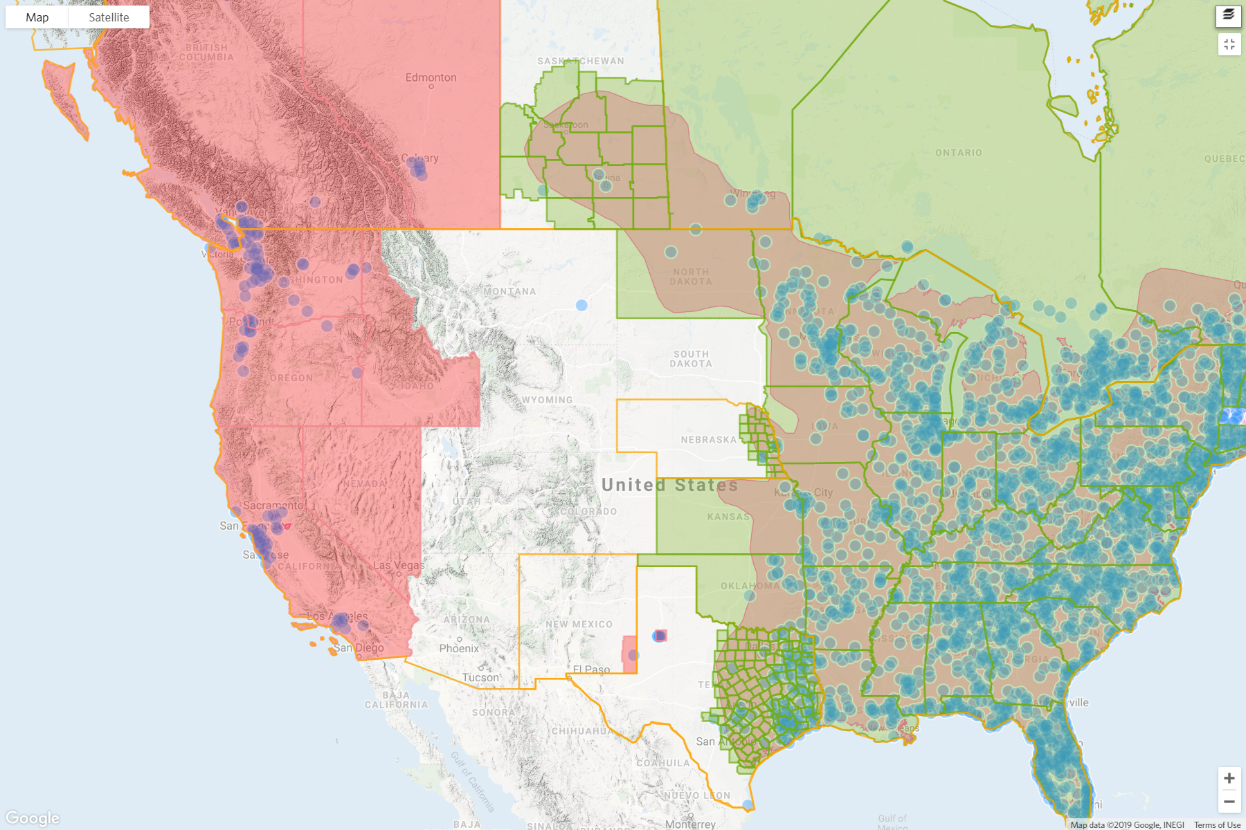
In the taxon map, places outlined with dotted lines have the establishment means set to introduced (solid lines for unknown, native, or endemic). In the atlas, introduced areas are marked in dark pink, a color very similar to the range polygon. The taxon map indicates whether there are RG observations in an area (green filled) or not (orange filled), while the atlas does not. I also find it strange that at the same zoom level, the atlas has already switched to showing county level presence while the taxon map is still at state level. Finally, the layers are stacked in a different order: in the taxon map it’s places, then range polygon, then observations, while the atlas has range polygon, then observations, then places.
I’m sure someone chose the symbology for a reason, I’m just curious what that reason may have been?
I think only @loarie could answer this fully, though see the partial answer at the bottom of the atlases page:
Displaying establishment means and observed/unobserved on atlas presence places
On taxon maps throughout the site, establishment means (native/non-native) is indicated by a dotted line and color indicates whether there are research-grade observations associated with a listed taxon (green) or not (orange). Currently, atlas maps are not displaying whether there are observations associated with atlas presence places or not. They are showing establishment means as follows: if any relevant listed taxa have native (or endemic) establishment means the atlas presence place displays as green, if all relevant listed taxa are introduced they display as red. There is currently not good atlas UI for setting establishment means.
I’ve found knowing where something is native/non-native at a glance (2nd screenshot, green/pink) more interesting/useful than which places it’s been observed on iNat (1st screenshot, green/orange). Whether there’s an observation dot in a particular place is pretty easy to tell, but it’s hard for me to “see” the solid vs. dashed indicating native/introduced in that 1st screenshot/taxon page maps.
I agree with cassi that I don’t think showing unobserved styling would be too interesting in atlases, but happy to change the introduced styling to a dotted line if folks would prefer that